CareHub: Simplifying Family Healthcare Management
Overview
CareHub is a responsive web application designed mobile-first to provide parents and caregivers a centralized, secure hub for managing their children's health records. It aims to streamline accessing, organizing, and sharing vital health information, reducing stress and saving time for busy families.
My Role: Sole UX/UI Designer
Responsibilities: User Research, Persona Development, Competitive Analysis, User Journey Mapping, Information Architecture, Wireframing (Low & High-Fidelity), Prototyping, UI Design, Accessibility
Considerations. Duration: March 2025 - April 2025
Tools: Figma, Pen & Paper.
The Problem
Parents today often face significant challenges managing their children's health information. Records are scattered across different providers, paper documents get lost, recalling appointment dates is difficult, and accessing immunization records for school or camp requirements can be a time-consuming, frustrating process. This disorganization leads to inefficiency, stress, and potential delays in care or administrative tasks.
Core User Pain Points Identified:
Inefficiency & Disorganization: Difficulty managing and finding records; scattered information.
Time-Consuming Processes: Calling offices, filling repetitive forms.
Stress & Overwhelm: Anxiety managing health info and deadlines.
Limited Access: Difficulty accessing information quickly, especially on the go or in emergencies.
The Goal
The primary goal was to design an intuitive mobile-first application that empowers parents to:
Easily review and manage their children's health records in one place.
Quickly access and share necessary documents (e.g., immunization records) for schools or camps.
Track and receive reminders for upcoming healthcare visits and preventative care needs.
Ultimately, reduce the stress and administrative burden associated with managing family health information.
My Role
& Responsibilities
As the sole UX designer on this project, I drove the entire design process from initial research and ideation through to high-fidelity prototyping and UI design. I was responsible for defining user needs, designing the information architecture and user flows, creating wireframes and mockups, and considering accessibility standards.
The Approach & Process
I followed a user-centered design process, focusing on understanding user needs and iteratively developing solutions. Key phases included:
Discover: Competitive analysis, user research (personas, pain point identification).
Define: Research, defining user journeys, user stories, and value propositions.
Develop: Ideation, sketching, wireframing, prototyping, UI design.
Deliver: High-fidelity prototype, accessibility considerations, defining next steps.
Discovery
& Research
Competitive Analysis
Strengths: Existing platforms often integrated with providers (MyChart) or offered comprehensive features (Healthspek).
Weaknesses: Many suffered from inconsistent or complex UX, limited offline access, and lacked features specifically tailored to proactive child health management (like detailed milestone tracking).
Opportunities: A significant opportunity exists to provide a superior, intuitive user experience focused specifically on parents' needs, offer robust child-specific features (growth tracking, "Health Passport"), ensure offline access to critical info, and build trust through transparency and security.
Understanding User Needs
Based on common parental challenges, core pain points were identified (listed earlier). To further empathize with potential users, three distinct personas were developed representing different needs and technological comfort levels:
Sarah (The Organized Parent): Tech-savvy, needs efficiency and centralized control. Frustrated by fragmented systems and time-consuming tasks.
David (The Stressed Parent): Time-poor, less tech-savvy, needs simplicity and clear reminders. Overwhelmed by complexity and paperwork.
Maria - The Proactive Parent): Wants detailed tracking, reliable info, and control over comprehensive data.)
These personas guided design decisions, ensuring the app catered to a range of user needs and contexts.
Defining the User & Synthesizing Research
User Journey Mapping
To visualize user struggles, I mapped out Sarah's current process for obtaining immunization records. This highlighted multiple pain points like phone calls, waiting times, and potential for lost information, reinforcing the need for a digital solution.
User Stories
Key user stories were derived from the personas' goals and frustrations, translating needs into actionable requirements for the app:
Sarah (Organized Parent), I want to easily access and review my children's health records on any device, so that I can quickly find the information I need.
David (Stressed Parent), I want to receive clear and concise reminders for upcoming appointments, so that I can manage my child's healthcare needs without feeling overwhelmed.
Maria (Proactive Parent), I want to track detailed health information for each of my children, so that I can maintain a comprehensive record of their health history.
Value Propositions
CareHub aims to deliver value by providing:
Centralized & Organized Records: One secure place for everything.
Convenient Access & Sharing: Information available anytime, easily shareable.
Proactive Reminders: Reducing missed appointments.
Reduced Stress: Simplifying a complex aspect of parenting.
Ideation & Design Solutions
Information Architecture
& Sketching
Early ideation focused on organizing information logically. Initial paper sketches explored different layouts for the dashboard and profile pages, prioritizing easy access to alerts, profiles, and document scanning. Key elements identified ("starred") were carried forward.
Digital Wireframing
Paper sketches were translated into low-fidelity digital wireframes in Figma. The focus remained on clarity and efficiency:
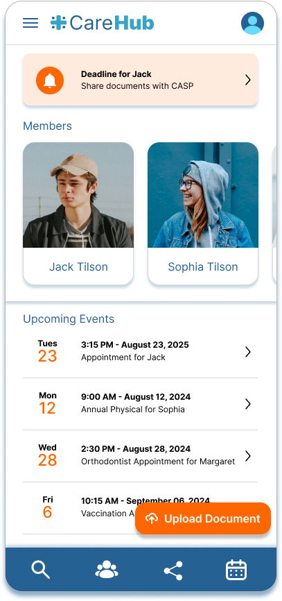
Dashboard: Designed to present essential information upfront (reminders/alerts, profiles) and provide quick access to document scanning.
Profile Screen: Organized individual information logically, with clear pathways for finding documents and sharing options.
Prototyping
& Testing
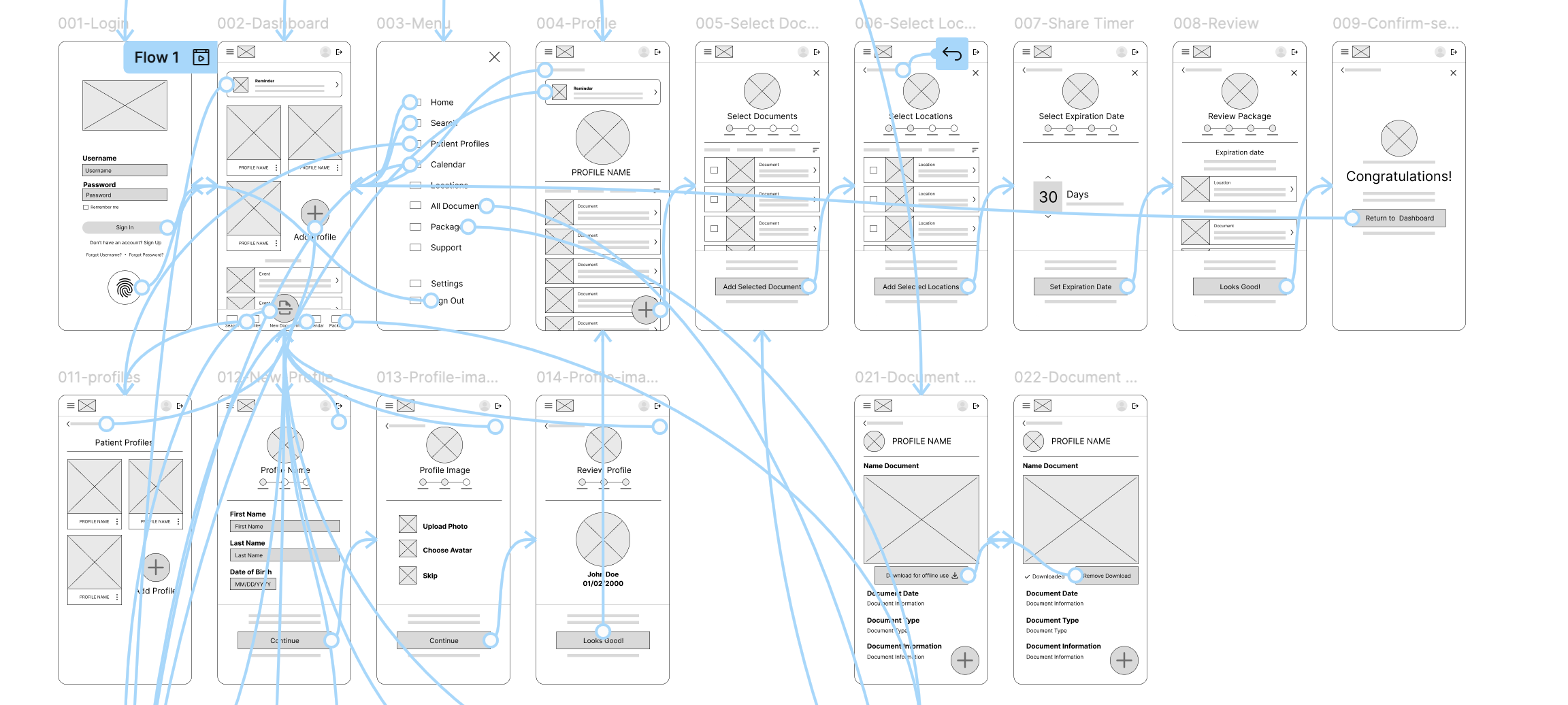
Low-Fidelity Prototype
& User Flow
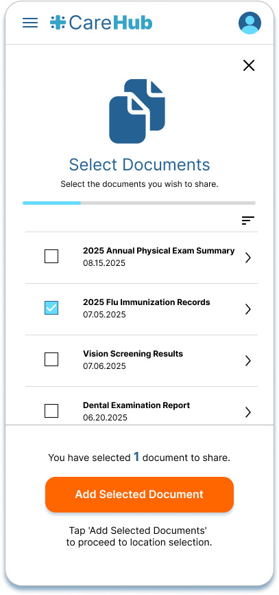
A clickable low-fidelity prototype was created focusing on a key user flow: collecting and sending immunization records electronically. This allowed testing the core navigation and task completion before investing in detailed UI design.
High-Fidelity Mockups & UI Design
Wireframes were developed into high-fidelity mockups with a clean, calming, and intuitive visual design. Key iterations based on (simulated/informal) user feedback included:
Dashboard: Initial design prioritized profile cards. Feedback indicated users often wanted upcoming events/reminders more prominently.
Solution: Implemented a profile carousel and gave more space to the alerts/reminders section. On the profile screen, Initial design prioritized documents. Feedback suggested upcoming events were more immediately relevant. Solution: Rebalanced the hierarchy to give events/reminders better visibility alongside document access.
Interactive High-Fidelity Prototype
An interactive prototype was built in Figma simulating the core app functionalities, allowing for a realistic feel of navigating the app and completing key tasks like finding records and accessing reminders.
Accessibility Considerations
Color Contrast
Ensured sufficient contrast between text and backgrounds met WCAG AA standards.
Descriptive Labels
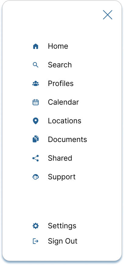
Buttons and interactive elements feature clear text labels alongside icons.
Action Feedback
Provided clear visual confirmation (e.g., success screens) upon task completion.
The Final Solution
The final design for CareHub presents a clean, mobile-first interface that centralizes health records, simplifies document access and sharing, and provides timely reminders. The intuitive navigation and clear information hierarchy aim to reduce parental stress and empower users to manage their family's health proactively.


Outcomes
& Reflections
Impact
While a conceptual project, informal conversations about the app idea were met with enthusiasm. One potential user exclaimed, "I would use that!", highlighting the perceived need. Feedback also indicated the app's potential value extends beyond children to managing records for aging parents or other dependents. This suggests a strong product-market fit potential.
What I Learned
This project was invaluable for applying the end-to-end UX process. Key learnings included:
The Power of Iteration: Witnessing the design evolve based on testing and feedback (even simulated) was crucial. Initial assumptions were effectively challenged and refined.
Balancing User Needs: Designing for multiple personas (like Sarah's need for detail vs. David's need for simplicity) requires careful consideration of hierarchy and flexible interfaces.
Importance of Research: Even simulated research exercises like persona creation and competitive analysis provide critical direction and prevent designing in a vacuum.
Next Steps
If this project were to move forward, the next steps would include:
Broaden User Base
Allow management of records for entire family extended family.
Integrate Health Metrics
Add tracking and visualization for metrics like growth charts.
Explore Billing Integration
Consider adding features for managing
healthcare payments.


